Stranger Things Color Palettes

Stranger things Color Palettes
The third season of the Netflix's Stranger Things has started, kids.
And to get in the mood, let's have a look at the images and colors of this season.


As you can see, the night shots are colorgraded in the synthwave/cyberpunk style, lots of blues and magentas, and some of the day shots are very similar to the coloring in Wes Anderson's Moonrise Kingdom, with lots of browns and warm colors, but in the Anderson film the skies are faded white and there is a yellow tone on everything and the darks are faded or matte. The coloring on the Stranger Things is very saturated, as the 80's were.
Check by yourself:
Tron:

Moonrise Kingdom:

Two articles to read about the color grading of ST3:
In case you are clueless about the font used in the titles of the series:
It's ITC Benguiat by Ed Benguiat.
Check this out:
Listen to the soundtrack on Spotify:
Behind the Scenes
1. All the images from the Netflix's Stranger Things.
2. Click the palette to download the colors (5) in different formats (Color Schemer Studio, SVG, Expression Design Swatch, WPF Resource Dictionary, Silverlight XAML, Adobe Swatch Exchange, ACO, AI, GPL, HTML or everything in a zip file), at Colourlovers . com
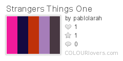
Color by COLOURlovers
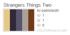
Color by COLOURlovers
3. Also I created extended versions of the palettes, with fifteen (15) colors, including formats: Adobe Swatch Exchange, ASE, png and text with all the colors.
The Stranger Things Color palettes:
Download
4.- The font in use in the cover I created is:
Neoneon by Bakoom Studio
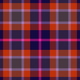
5.- I created a pattern at Colourlovers in tartan, I called it Stranger Tartan.


Comments
Post a Comment