Dark Color Palettes

God doesn’t have a plan.
Netflix's Dark is
Netflix's Dark
"a German science fiction thriller web television series co-created by Baran bo Odar and Jantje Friese. Set in the fictional town of Winden, Germany, Dark concerns the aftermath of a child's disappearance which exposes the secrets of, and hidden connections among, four estranged families as they slowly unravel a sinister time travel conspiracy which spans across three generations. Throughout the series, Dark explores the existential implications of time and its effects on human nature."
(Wikipedia)
If you haven't watched it yet, you have to.


Trailer:

The story is charming and the visuals striking. Once it was called the "Stranger Things for Adults".
A bunch of people have written about it.
Some have seen a relation of the use of specific colors (red, yellow, blue) with the symbol of the Triquetra, or the three years in the timeline (I do not want to give you spoilers), or the Trinity:
"Now if you take a look at a color wheel, you will see that these 3 colors stand in a triadic relation to one another. Essentially, with the triadic harmony, you are using three equally distanced colors on the color wheel – just like the trinity symbol, which in the series connects the 3 equally distanced times (1953, 1986, 2019)."
Some commenters suggest there is a relation with alchemy too. I found an interesting article explaining some of the colors in the alchemical process:
"The first four color terms – black, white, red, and yellow – are also the primary color terms embracing the entire alchemical opus: nigredo, albedo, xanthosis or citrinitas, and iosis or rubedo. These color terms describe: (1) stages of the work; (2) conditions of the material worked on; and (3) states in the psyche of the artifex or worker-alchemist.” ( Hillman, James (2011-10-10). Alchemical Psychology)
If we follow the Goethe's Color Theory, the yellow jacket that the main character was wearing during the first season, represents him, the Good guy. And the red from the lipsticks or some clothes are the Beauty. The red, for me, represents the Sin too in this cosmogony.
I found an interesting article about the process of filming but no about color:
As you see, they created Luts to colorgrade the different day and night scenes.
I have seen a predominant Teal & Orange colorgrading. See the blues and teals in the shadows of the Tick-tock scene. Most of the skin tones, however, are more pink than orange. At the scene of the girl with the bike, there are mutted blues and oranges. Some outdoor night scenes, as the scene of the excavation in the garden with lamps, have deep shadows and colorful lights, with predominant reds and blues. My favorite scenes, of the torture charmer, mostly because of the colors and less for the torture, have a cold look, with a predominant cyan making the reds super notorious. Colorhexa defines that cyan as Strong.
#1abb98 color description : Strong cyan.
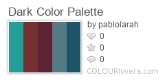
Well, here are the palettes I created. I mixed them all in the poster at the beginning of the post. I got the predominant colors, in the column of the right with the first color as the most predominant and the last, the less.
I chose the color palette of the torture room, the one with toys, to create the Dark color palette.
Take a look at the original palettes:


Netflix's website:
Listen to the soundtrack at Spotify, with my favorite German music band, Apparat:
Behind the Scenes
1. All the images from the Netflix's Dark.
2. Click the palette to download the colors (5) in different formats (Color Schemer Studio, SVG, Expression Design Swatch, WPF Resource Dictionary, Silverlight XAML, Adobe Swatch Exchange, ACO, AI, GPL, HTML or everything in a zip file), at Colourlovers . com
Color by COLOURlovers
3. Also I created extended versions of the palettes, with fifteen (25) colors, including formats: Adobe Swatch Exchange, ASE, .png and .text with all the colors.
The Dark Color palette:
Download
4.- The font in use in the cover I created is:
Lato by Łukasz Dziedzic
5.- I also made a pattern at Colourlovers.

Get it in different sizes at:
http://www.colourlovers.com/pattern/5812881/Time_Traveler_Tartan


Comments
Post a Comment