Selection of Serif & Display typefaces from Google Fonts
Denn die Todten reiten schnell
A
few days ago I was looking for a font similar to an inktrap
typeface I saw on a TV Literary show on TV Brasil. I found it. So I
wanted to share with you some beautiful and bold fonts from the Google library I found while I was in my quest.
The TV show name is Trilha de Letras (Trilha recebe o historiador, escritor e compositor Luiz Antonio Simas) And here you have a screenshot:
Quote:
A cidade, em meio ao cenário deslumbrante, foi forjada na espoliação dos habitantes originais, na violência da escravização, nos projetos higienistas das elites contra pretos e pobres.
🍑
The city, in the midst of the dazzling scenery, was forged in the dispossession of the original inhabitants, in the violence of enslavement, in the hygienist projects of the elites against blacks and the poor.
Luiz Antonio Simas
Here we go.
1.- Suranna
The Telugu is designed and developed by Purushoth Kumar Guttula in 2013 and made available by Silicon Andhra under the SIL Open Font License v1.1. The Latin is designed by Cyreal, a type foundry in Moscow Russia, and originally published as Prata. The Suranna project is led by Appaji Ambarisha Darbha, a type designer based in Hyderabad, India. To contribute, see github.com/appajid/suranna
Download the font:
https://fonts.google.com/specimen/Suranna
2.- Viaoda Libre
Viaoda Libre is a display family inspired by Vietnamese cultural symbolism.
Designed by Gydient & ViệtAnh Nguyễn
https://gydient.com/
IG: gydient
Download the font:
https://fonts.google.com/specimen/Viaoda+Libre
3.- Bigshot One
Bigshot One is a contemporary Didone.
Designed by Gesine Todt
IG: gesinetodtdesign
https://www.gesine-todt.de/
Download the font:
https://fonts.google.com/specimen/Bigshot+One
4.- Libre Caslon Display
Libre Caslon Display is the display version of Libre Caslon Text. The family is optimized for web headlines.
Designed by Impallari Type
https://www.impallari.com/fonts
Twitter: @impallaritype
Download the font:
https://fonts.google.com/specimen/Libre+Caslon+Display
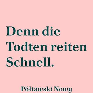
5.- Półtawski Nowy
Półtawski Nowy is a digitisation project the Antykwa Półtawskiego typeface. A key aspect of the design of the digital version of the typeface from 1928 was the approach to the issue of developing the shape of characters from sources.
To contribute see github.com/kosmynkab/Poltawski-Nowy
Designed by Adam Półtawski, Mateusz Machalski (IG: machalski.studio) , Borys Kosmynka, Ania Wieluńska.
Web: https://capitalics.wtf + https://typoteka.pl/en/designer/adam-poltawski
Download the font:
https://fonts.google.com/specimen/Poltawski+Nowy
6.- Kavoon
Kavoon is a display face based on experiments with brush and ink.
Designed by Viktoriya Grabowska
https://viktoriyagrabowska.com
Foundry: Sorkin Type Co sorkintype.com
Download the font:
https://fonts.google.com/specimen/Kavoon
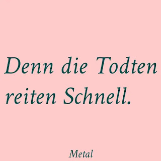
7.- Metal
Metal is a Khmer font with a design similar to the Khmer Italic metal types published in Cambodia before 1970.
Designed by Danh Hong
Blog: https://khmertype.blogspot.com/
To contribute, see github.com/danhhong/Metal
Download the font:
https://fonts.google.com/specimen/Metal
8.- Tapestry
Tapestry is a Roman calligraphic family with a slight rustic and country appearance.
To contribute, see github.com/googlefonts/tapestry
Designed by Robert Leuschke
Bio at Devroye: http://luc.devroye.org/fonts-27562.html
Download the font:
https://fonts.google.com/specimen/Tapestry
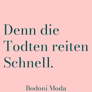
9.- Bodoni Moda
Bodoni Moda is a no-compromises Bodoni family, built for the digital age.
Designed by Owen Earl.
The Bodoni Moda project is designed by Owen Earl (indestructible type*). To contribute, see github.com/indestructible-type/Bodoni
https://indestructibletype.com/Home.html
Download the font:
https://fonts.google.com/specimen/Bodoni+Moda
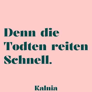
10.- Kalnia
Kalnia is a variable font with weight and width axes designed with high contrast and refined terminals, drawing inspiration from the Victorian era.
Designed by Frida Medrano IG: fridaemg
To contribute, see github.com/fridamedrano/Kalnia-Typeface
https://www.fridamedrano.com/
Download the font:
https://fonts.google.com/specimen/Kalnia
11.- Gloock
Gloock is a contemporary high-contrast serif typeface intended for display use.
To contribute, see github.com/duartp/gloock.
Designed by Duarte Pinto.
Download the font:
https://fonts.google.com/specimen/Gloock
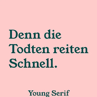
12.- Young Serif
Young Serif is a heavy weight old style serif typeface, taking inspiration from Plantin Infant or ITC Italian Old Style.
To contribute, please see github.com/noirblancrouge/YoungSerif.
Designed by Bastien Sozeau
https://noirblancrouge.com/
Download the font:
https://fonts.google.com/specimen/Young+Serif
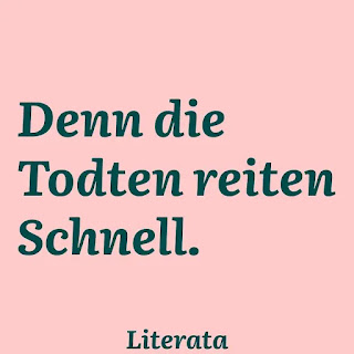
13.- Literata
Literata is a distinct variable font family for digital text.
To contribute, see github.com/googlefonts/literata
Design by TypeTogether
https://www.type-together.com/
Twitter: @TypeTogether
Download the font:
https://fonts.google.com/specimen/Literata
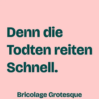
14.- Bricolage Grotesque
Bricolage Grotesque is a collage of lots of different things: historical sources, technical decisions and personal feelings. It started as a fork of Mayenne Sans, an open-source single weight font designed by Jérémy Landes (Studio Triple). It evolved by reinforcing cues from French sources and British sources: the compressed weights lean more towards the anxious and wonky tones of Grotesque Nº9 and the regular weights have a bit more of Antique Olive's relaxed and confident attitude.
To contribute, see github.com/ateliertriay/bricolage
Designed by Mathieu Triay
https://www.mathieutriay.com/
Download the font:
https://fonts.google.com/specimen/Bricolage+Grotesque
15.- Instrument Serif
Instrument Serif is a condensed display font designed for the Instrument brand. It is intended for use at large sizes and offers a contemporary take on some of the time-tested characteristics found in old-style serifs.
Instrument: https://www.instrument.com/
To contribute, please see github.com/Instrument/instrument-serif.
Designed by Rodrigo Fuenzalida & Jordan Egstad
Web Rodrigo: https://www.behance.net/erreefe
Web Jordan: https://egstad.com/
Download the font:
https://fonts.google.com/specimen/Instrument+Serif
The Quote
The phrase I used for displaying the specimen is a quote from a German poem.
"Lenore", sometimes translated as "Leonora", "Leonore" or "Ellenore", is a poem written by German author Gottfried August Bürger in 1773, and published in 1774 in the Göttinger Musenalmanach. "Lenore" is generally characterised as being part of the 18th-century Gothic ballads, and although the character that returns from its grave in the poem is not considered to be a vampire, the poem has been very influential on vampire literature.
(Wikipedia)
But then, published in 1897 by Bram Stoker, appears in Dracula
“That is why, I suppose, you wished him to go on to Bukovina. You cannot deceive me, my friend; I know too much, and my horses are swift.” As he spoke he smiled, and the lamplight fell on a hard-looking mouth, with very red lips and sharp-looking teeth, as white as ivory. One of my companions whispered to another the line from Burger’s “Lenore”:—
“Denn die Todten reiten schnell”—
(“For the dead travel fast.”)
The strange driver evidently heard the words, for he looked up with a gleaming smile. The passenger turned his face away, at the same time putting out his two fingers and crossing himself.
Bram Stoker's Dracula at Gutenberg
That’s my selection. I hope you’ll like them.








Comments
Post a Comment