Spot Illustrations: definitions, tutorials and examples
Spot Illustrations!
Definition:
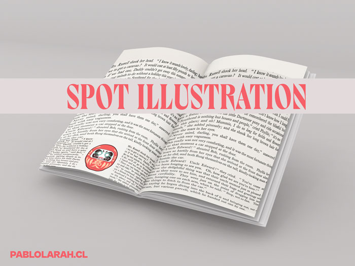
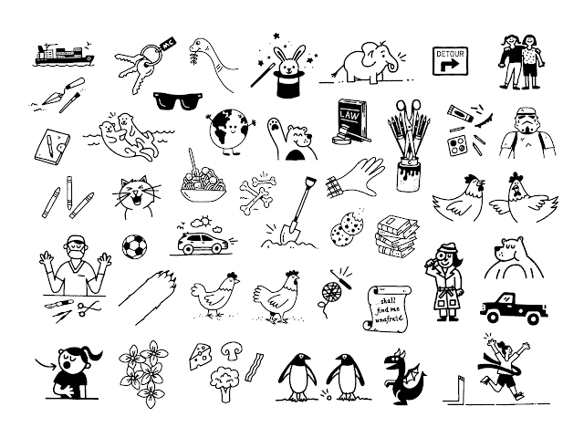
"A spot illustration is a small free-floating motif, usually with no background. In picture books spots are particularly useful as visual addenda to the main narrative." (John Shelley, Words and pics)
"The idea concerned spot illustrations—the cozy little drawings of, say, a fork, a chair, or a window dotted with hanging plants—tucked into long sections of text. " (Sarah Larson, The New Yorker)
"These are small, simple illustrations to liven up a page with text. They’re usually a quarter of a page or less with little or no background. Spot illustrations can be placed as a chapter heading, corner decoration, or next to or within a body of text. They are often black and white or done in a sketchy style." (Karen Ferreira, GetYourBookIllustrations )
"Spot illustrations are meant to be read." ( Meg Robichaud, Shopify UX)
Video tutorials:
1.- Illustration Masterclass - Creating Spot Illustrations (56:40 min)
2.- Editorial Illustration with Dan Matutina
3.- Behance Narrated Ep 10: How to Be an Editorial Illustrator | Adobe Creative Cloud
Examples:
1.- Spot illustrations for the one-page guide section of New York Magazine.
2.- Wired Spot Illustrations
by Tom Jennings
3.- Washingtonian: George Washington Quotes
4.- Editorial spot illustration for AARP The Magazine.
by Brad Cuzen
4.- Commissioned Spot illustrations
by Nahuel Bardi
5.- "Here's a bunch of drawings from five issues of Highlights Magazine. Since January, I work on each issue to add a bunch of doodles and little spot illos to the pages."
6.- Spot Illustration for The New Yorker.
by Kyle Webster
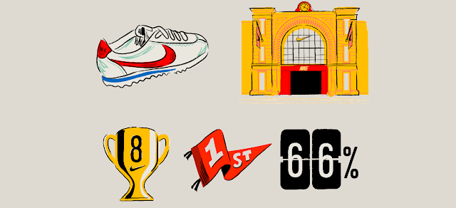
7.- Hoodzpah: Nike “Commitment to L.A.” Lettering & Illustrations
8.- Spot illustrations The Food Issue for the NewYorker
Want learn more?
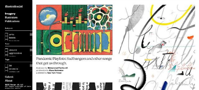
Check the new project Illustration dot lol - Editorial illustrations from around the world
by Shane Zucker @shanezucker
#illustration #Editorial #Archive
Also you can check Spot/Editorial Illustrations at the feeds of:








Comments
Post a Comment